

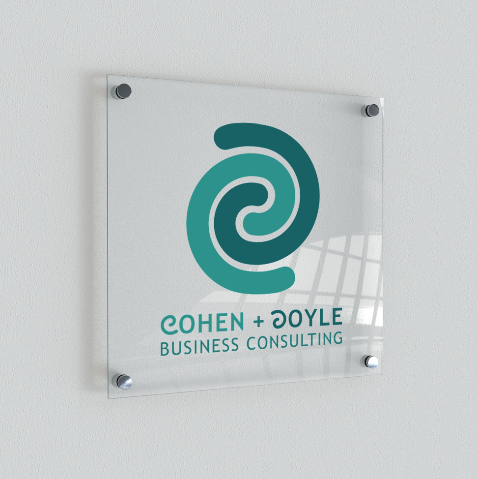

*The company / client used in this design does not exist

Fabricated clients Cohen + Doyle Business Consulting’s new brand identity included a cohesive logo, brand marks and colour palette - which could be used in an array of different contexts. The logo / brand marks incorporate the letters C and D wrapped around each other in different shades of blue, reflecting the cohesiveness of the business partners’ business practices and illustrates how each partner specialises in their own area of expertise.